Key Takeaways
- A Pantone code is a target, not a promise; expect a practical ΔE tolerance around 1.5-3.0 on powder coat.
- Matte and textured finishes shift perception more than gloss; the same brand color can look 10-20% darker on a matte bottle.
- Sample under D65 light and approved master sample, not only on a monitor; factory and office lighting in China can mislead you.
- MOQ for stable color control is usually 3,000 units; under 1,000 units, color consistency and setup cost get expensive fast.
If you want a brand color on a powder-coated bottle, the Pantone code is the easy part. The hard part is getting that color through metal prep, powder chemistry, oven cure, and gloss control without a surprise shift. A sample that looks right under a 6500K light box in Hangzhou can read different on a desk in New York. Close is normal. Exact is rare.
Most marketing teams ask for one thing: a custom Pantone bottle that matches the brand guide, prints the logo cleanly, and stays steady across 5,000 or 50,000 units. That sounds simple until QC pulls the first spray-out card and the buyer flags a 0.5 gloss point or a slight warmth in the red. We run powder-coated drinkware at a 3,000 units MOQ, with 18-25 days after sample approval, and color sign-off is the step that saves the schedule or blows it up. This is the wrong question to ask: “Can you match Pantone?” The better one is, “Which finish, light source, and tolerance are we locking?”
What Pantone can and cannot do
Pantone gives both sides one reference point. That is the part it does well. Powder coating is a dry pigment layer cured on metal at roughly 180-200°C, and that heat can shift the final shade by a step or two. The same Pantone code can read differently on stainless steel, cold-rolled steel, or aluminum because each base throws back light in its own way. If you expect a perfect one-to-one visual copy, the math does not work.
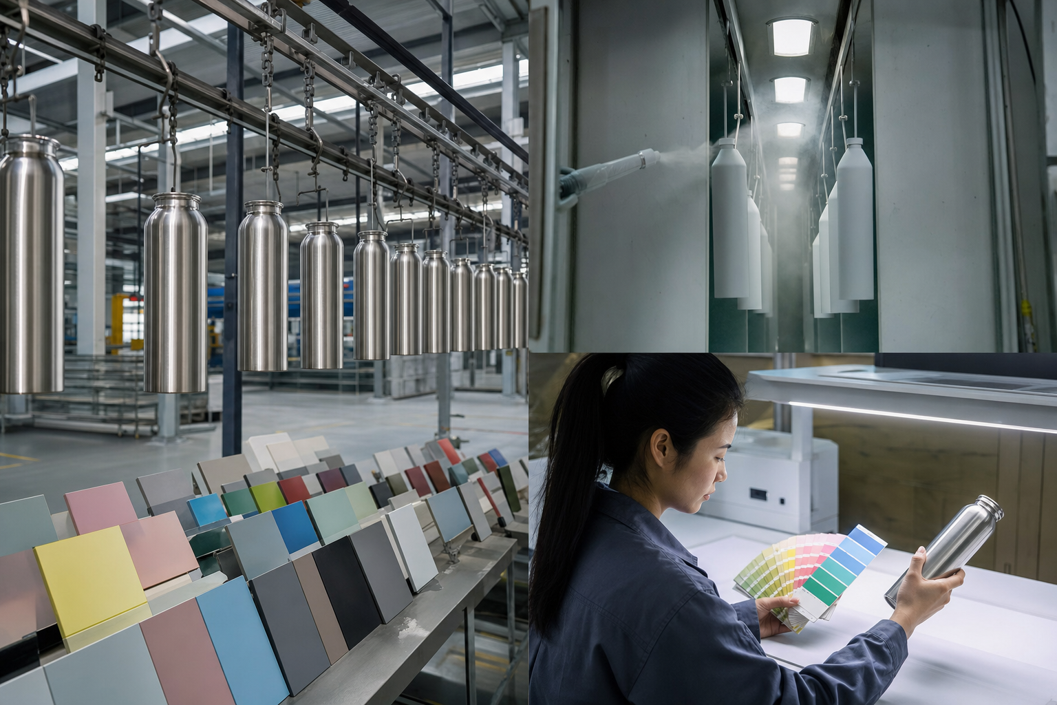
What works is a controlled target. We ask for the exact Pantone book reference, finish preference, and whether the buyer wants matte, satin, or gloss. Then we run a lab dip or a sprayed panel first. QC pulled the sample at 25 microns on one run, and the buyer flagged the blue before we ever touched the line. On bottles, a good Pantone match powder coat usually sits within a visual tolerance the eye accepts under retail lighting, with a measured color difference around ΔE 1.5-3.0, depending on the finish and the brand’s tolerance. If your brand book demands a tight corporate red or blue, expect 2 or 3 sampling rounds, not 1. We have seen this go sideways when the PO says “dark red” and the customer means a specific Pantone chip. For export orders from Zhejiang, the first sample is seldom the last approval. Budget 7-10 days for color confirmation before mass production.
Ask for a physical sprayed sample, not just a color code promise.
Why powder coat shifts color
Powder coating is not ink. We run a polymer film, and the finish changes with coat thickness, oven dwell, and texture. On the line, a 70-90 micron coat can read different from a 100-120 micron coat even with the same pigment batch. Thicker film pulls the color deeper and knocks down brightness. That is why brand owners get surprised: marketing approves a Pantone on a screen, then QC pulls the sample off a curved metal body and the match shifts.
Gloss level trips people up fast. High gloss throws back more light, so colors look cleaner and more saturated. Matte does the opposite. A matte navy bottle can look almost black under warehouse LEDs; the same navy in gloss may look lighter and more vivid. Curvature plays its part too. A flat powder-coated panel is easier to match than a double-wall bottle with shoulders, base taper, and a threaded neck. On a 500 ml stainless bottle, the shoulder often catches light differently from the body, so the same coat can read as two shades if you inspect it closely. That is normal. Not a defect. The buyer flagged it on a 3,000 pcs order once, and the math did not work because they were judging the bottle like a chip, not a formed part. Define the standard first, or you end up arguing about optics, not production.
- Typical coating thickness: 70-100 microns for most promotional bottles
- Common cure window: 180-200°C for 10-20 minutes, depending on powder system
- Perceptual shift: matte coatings can appear 10-20% darker than gloss
How to brief your factory correctly
If you want tighter color matching, do not brief us with only a Pantone number. Give the factory the product type, material, finish, and decoration method. A powder-coated bottle is a process, not a chip card. Tell us if the logo will be silk screen, laser engraving, UV print, or a second-color coat. White on dark usually forgives small drift; metallic on a deep corporate color does not. If the bottle must sit inside a brand control standard, say it plainly.
The best brief has five items: Pantone reference, finish level, approved physical sample if you have one, target bottle model, and which tolerance matters most. Example: “Pantone 7686 C, matte, approved from last year’s show sample, 750 ml stainless sports bottle, acceptable visual match within normal daylight.” That brief works. “Make it the same blue as our website” does not. Send the order size early too. On our line in Zhejiang, 3,000 units can get its own color batch; a 500-unit rush often has to use stock powder, and the math does not work out the same. QC pulled a sample once where the buyer had written 7686 C on the PO but typed 7866 C in the email, and the mismatch wasted a day. If you need one brand color across several SKUs, keep the same powder formula and gloss level, then handle the logo process separately. That is the cleaner way to ship into Europe and North America.
What to send before sampling
- Pantone code with suffix, such as C or U, if relevant
- Target MOQ and projected repeat order size
- Desired finish: matte, satin, semi-gloss, or gloss
- Packaging and shelf environment, if the bottle must match other SKUs
The approval process that saves time
Good color approval runs on procedure, not mood. Start with a sprayed sample or a 50-piece pilot run. Then check it under standard daylight, ideally D65. Warm office LEDs will push some blues greener and some reds browner. Put the bottle next to the real brand asset: a carton, hang tag, or retail panel. Do not approve from a phone photo. Camera white balance hides the problem until the buyer flags it.
For export orders, we use a two-step signoff: first the color panel or sample bottle, then the first-article piece off the line. If the sample and first article do not match, we stop the line before full run. That one day beats reworking 20,000 bottles. In our Hangzhou shop, QC pulled the retained master sample last week with a Mitutoyo caliper at the bench, and we checked the production lot against it at AQL 2.5 for major defects and 4.0 for minor appearance issues, per the PO. A buyer once sent “Pantone 18-3940” on a PDF, but the file had no coating gloss note, so the math did not work. Brand teams in North America often approve from a screen, while distributors in Europe open cartons and compare the goods on arrival. If the reference sample is loose, everyone argues later. If it is signed and stored, the argument ends fast.
Approve color in daylight, on a physical sample, against a retained master.
When you should accept a close match
There are cases where a close match is the right commercial call. Seasonal SKUs, gift sets, and promo launches do not pay for three rounds of color correction. If the bottle is one part of a bigger campaign, a small shift in saturation is fine as long as the logo, shape, and carton stay consistent. Marketing teams push for perfect color because they guard the brand. The buyer has to balance appearance, cost, and ship date.
Here is the rule we use on the line: if the bottle will sit side by side with your master sample in a showroom, you need tighter control. If it will sell online, sit in a warehouse, or go out in a bundle, a managed visual match is usually enough. On powder-coated bottles, I would rather give you the real answer than sell a fantasy. A perfect Pantone match on every batch is not realistic unless you allow tight process control, repeat powder sourcing, and a stable production calendar. That means fewer rush orders and more planning. It also means accepting normal batch variance. We run this in Zhejiang every week, and the numbers do not lie: the same powder lot holds better than a new lot, and a 0.5-1.0 delta is common before QC pulls the sample and checks it under the light box. The goal is not zero variation. The goal is variation your customer will not spot without a spectrophotometer.
- Accept close match for promotional runs, online-only sales, and short campaigns
- Demand tighter control for premium retail, corporate gifting, and long-term brand programs
Cost, MOQ, and lead time realities
Color matching changes price faster than most marketing teams expect. If we run a standard powder shade from stock, the color charge stays low. Once the buyer flagged a custom Pantone bottle with a dedicated powder formula, we added a setup fee and the first lot moved up in unit price. A common custom powder-coated bottle from a Zhejiang factory starts around USD 1.85-3.20 FOB for 500-750 ml stainless models, depending on the body build, lid type, and print method. Special colors, soft-touch finish, or an extra curing pass can add 0.12-0.45 USD per unit.
MOQ is where the math gets real. The line needs enough volume to justify a separate powder batch and gun cleanup, and a 1,000 pcs ask usually gets pushed back. For stable color runs, 3,000 units is a workable starting point; 5,000-10,000 units gives better control on repeat color and shade drift. Lead time after sample approval is usually 18-25 days for standard production, while a new powder formula adds 5-7 days. QC pulled the sample, checked the coating at 60-70 μm, and found the hue was still within range, but we still held shipment until the buyer signed off. If you need US or EU compliance, get the coating system and accessories checked against REACH requirements and, where relevant, food-contact expectations. Ask for test reports early. Waiting until the cartons are packed is the wrong question to ask. If the launch date is tied to retail or Amazon FBA, one missed approval can cost more than the sampling fee.
For procurement, the cheapest unit price is not the main target. Lock the spec early, keep the same powder code on reorders, and stop changing the finish at the last minute. We ship fewer headaches that way. A PO typo on one job changed the lid color code by one digit, and the whole batch had to be held. That is how Europe and North America keep brand color steady while still buying from China at scale.
Common mistakes buyers keep making
The biggest mistake is treating color like a line item instead of a controlled process. A Pantone code without finish, substrate, and approval method is incomplete. We see this on the line all the time. A buyer sends one code, then asks why the sample does not look like the phone screen. Screens are backlit; a powder-coated bottle sits under shop light, warehouse light, and carton light. Different animal.
Another common miss is splitting the order across 2 or 3 factories and expecting one exact color to repeat. Even in Zhejiang, the powder lot, curing oven, and QC routine are not the same. We run a 24-hour retained sample for that reason, plus a written tolerance of ΔE if the buyer asks for tight control. Skip that, and your “same brand blue” turns into three blues. The marketing team spots it fast. So does the customer. Changing the lid color, gloss level, or logo method after sample approval also resets the visual read, and the buyer flagged it on a recent PO because the strap on the 500 ml bottle made the body look 1 shade lighter. That is not us being stubborn. That is the math.
Buyers who get Pantone powder coat right use the first sample as a checkpoint, not a promise that production is done. QC pulled the sample, checked it under D65 light, and signed off only after the buyer confirmed the same reading on the master card. That saves money. It also keeps launches from going sideways.
Request a custom Pantone sample today
Send your Pantone code, finish target, and MOQ. We will quote the color setup, lead time, and sample path before production starts.
Frequently asked questions
Can you match any Pantone exactly on a powder-coated bottle?
No, not exactly in every case. A Pantone code is a target, but powder coat on curved metal is affected by substrate, thickness, gloss, and curing temperature. In practice, a good factory in Zhejiang can often hold a visual match within a ΔE range of about 1.5-3.0, which is acceptable for most marketing programs. For strict brand control, we recommend a physical master sample, not only a code. If you need a corporate blue or red to be judged under retail lighting, approve the sample under D65 and keep the same powder formula for reorders.
What MOQ do you need for custom Pantone color matching?
For a dedicated powder color, 3,000 units is a realistic MOQ. Below that, setup cost per bottle rises quickly, and the factory may need to use stock powder or blend a small custom batch, which can affect consistency. For 5,000 units or more, you usually get better color stability and lower unit cost. At our Hangzhou plant in Zhejiang, standard powder-coated bottle production can run 300,000 units per month across multiple lines, but custom color work still needs enough volume to justify the setup.
Why does matte powder coat look darker than gloss?
Matte surfaces scatter light instead of reflecting it cleanly, so colors look deeper and often 10-20% darker to the eye. The pigment formula may be identical, but the finish changes perception. That is why a Pantone match powder coat in matte can look closer to the swatch in one light and much darker in another. If your brand color is bright and clean, gloss or satin usually gives you a more forgiving result. If you want premium and muted, matte works, but you should approve it with a physical sample.
How long does it take to approve a custom Pantone bottle?
Allow 7-10 days for the first sample round, especially if a new powder formula is required. Once the sample is approved, production usually takes 18-25 days for standard orders, depending on order size and decoration. If you change finish, logo method, or lid color after approval, add time back into the schedule. For launch projects going into Europe or North America, it is safer to lock the sample first and then confirm packaging, because bottle color and packaging color can clash more than buyers expect.
What tests or standards should I ask for?
For export orders, ask for REACH compliance where relevant, and request coating or material test reports if your retailer requires them. For quality control, a factory should be able to work to AQL inspection levels, usually AQL 2.5 for major defects and 4.0 for minor appearance issues, unless your spec says otherwise. If the bottle is intended for food or beverage contact, confirm the relevant material and coating documentation early. If you are using FBA or retail distribution, ask whether the packaging can carry FNSKU or case labels without affecting the finish.